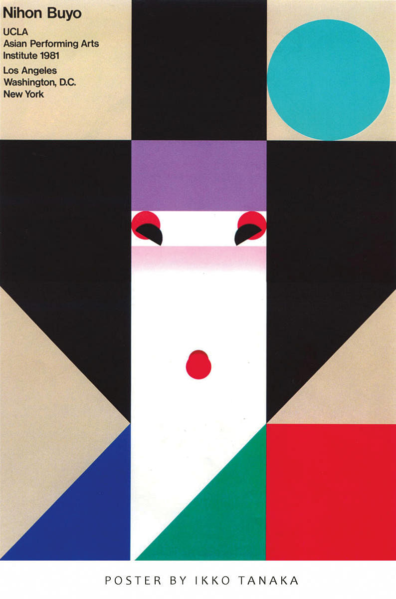
By the mid-1980s, America and Japan accounted for a staggering 40 per cent of the global economy. During the period of Bubble Economy (1980 to 1990), Japan had steadily risen from the ruins of a war (which had destroyed its prestige, devastated its cities, and gutted its industrial capacity) to become the world’s second-largest economy.
As the country witnessed rapid economic growth and prosperity during the Bubble Economy, the dollar became cheaper; personal savings of most Japanese rose substantially; and banks were flush with funds. This meant a complete shift in lifestyle and outlook for people in Japan. “The frugality and austerity that defined the country during the post-war era slowly gave way to extravagance and conspicuous consumption,” observes Japan-based journalist, Eric Johnston. “It was also a period of increased international travel, as the Japanese went to the United States, Europe and Oceania in record numbers, shopping for expensive objects, gifts and Louis Vuitton and Gucci handbags, Savile Row and Armani suits, and the finest wines.”
One of the major outcomes of the Bubble Economy was that Japanese enterprises began to advertise heavily, and moved towards a campaign-style format of television commercials and other emerging media. Substantial sums were invested on advertising and publicity, which encouraged graphic designers to experiment and innovate with different kinds of techniques, mediums, formats and content.
Burning butterflies
Designers of that era did not just exploit the medium of graphic design for commercial and financial considerations, but also to express their thoughts and concerns about globalisation, environmental degradation, societal behaviour, and overall social conditions affecting the larger populace. Among the most striking posters, which came out during the period were those created by Yusaku Kamekura (1915-1997), often referred to as Japan’s most important designer of the 20th century and the 'Father of Japanese Graphic Design.’
Kamekura was known to admire the rational and functional design systems of the West, as also the charm and grace of traditional Japanese design and heritage. Showcasing an insightful visual inventiveness and minimalist approach, his posters attracted national and international attention and admiration. One of Kamekura’s poetic posters, titled Hiroshima Appeals (1983), showed a clutch of burning butterflies tumbling in anonymous space, evoking a deep sense of tragedy following the nuclear bombing. In an interview, the master designer explained his thoughts behind the fashioning of the award-winning poster: “Skeletons and nuclear mushroom clouds are beautiful and (at the same time) frightening. I wondered how I could make something that had those qualities, and yet, you could also hang it in a room. I thought then of the burning butterflies.”
Another equally gripping work by Kamekura was created for the Bicentenary of the French Revolution and the Declaration of the Rights of Man and Citizen (1988). In this image, a solitary figure stands behind bars, reflecting physical and existential angst. His emblematic 1964 poster for the 18th Olympics in Tokyo and Expo ‘70 in Osaka were hailed for their visual simplicity, strength and freshness. In a series of posters for the publicity campaign of the 18th Olympics, he included dramatically-angled photographic images of swimmers and runners, with a definitive punch.
In an article in Graphic Design magazine, Kamekura said: “No matter how much money I am offered, I will not do work that I am not convinced is right. This means that I refuse to do any work for political parties or religious groups, because I find that I usually cannot agree with their ideals and purposes.”
Kamekura was an inspirational figure who set up several institutions to promote graphic design. He encouraged young designers to expand their knowledge and skill, and go beyond the conventional standards of design, advertising and commerce. He was a godfather to many artists such as Ikko Tanaka, who once said: “Kamekura was thrilled with the world. He taught me how to see.”
Powerful imagery
Like Kamekura, Tanaka (1930–2002) was also known for marrying the past with the present and combining traditional Japanese illustrations with a very graphic, colourful, and modern approach. “I would like my posters to be lively, straightforward, and yet powerful in imagery,” he once said. “Posters must be enjoyed by the masses. I want to design them so that people would love to hang them on the walls after they have served their initial role of conveying messages and information.”
Tanaka’s own version of Hiroshima Appeals featured an adorable white dove as a symbol of peace in turbulent times. One of his best-known posters, conceived in 1981 for the dance troupe Nihon Buyo Performance and reused for various purposes, featured an abstract version of a geisha. (As a youngster, he was involved in modern drama and had joined a theatrical study group. There, he became acquainted with Kabuki and Hokusai's 19th-century wood block prints.)
Tanaka too was an influential designer whose works transcended time and space. “I am particularly fond of a book Tanaka released in the 1980s called Japan Colour,” writes London- based fashion designer Paul Smith. “It’s over a 100 pages in length, but contains nothing but pages filled with blocks of a single colour. This book is like a designer’s dream. Each page’s recto and verso have the same colour, but as you flick through the book, you realise how different a colour can appear in relation to the shade that’s sitting on the page opposite it. Put orange next to another hot colour and it looks fiery. But, put orange next to something more muted and it feels fresh. This makes you realise how powerful colour is in determining what you’re trying to say.”
Students of art, design and architecture would immensely benefit by exploring these masters of poster art from Japan and elsewhere. It would not only help them appreciate the aesthetic potential of the medium, but also provide a cost-effective way of disseminating significant social messages relating to our troubled times.