
Film posters have come a long way, starting out as hand-drawn, hand-painted bills in the silent era and galloping to digital motion teasers now. However, designers say the secret to a good poster lies first in the concept. They illustrate with examples.
Make it uníque
One of India’s leading designers Jayaram Ramachandran says a poster has to be unique, a concept taught in MBA classrooms with the story of a purple elephant. Jayaram learnt of the concept from the producer of 2015 Malayalam film ‘Ennu Ninte Moideen’, for which he designed posters.
“The story is about a man who saw a lot of elephants in a jungle. When he reached home, he remembered only a purple elephant from the herd. The bottom line is, you have to stand out for people to notice you,” Jayaram recalls. He put the purple elephant theory into practice with a poster of ‘Ennu Ninte Moideen’, a tragic romance based on a true story.
Using Photoshop, he juxtaposed a torn paper on a still from the film. The paper had a dialogue written on it. A torn-paper effect would make people curious, he knew. Plus it hinted at the premise: The couple is forced apart by parents.
Snapshot of film
Well-known publicity designer from the Tamil film industry, Gopi Prasannaa, says a poster must capture the soul of the film. He showed how it is done with the poster of the cult romantic Tamil film ‘96’, which released in 2018.
In the film, the lead pair reminisces about their days as childhood sweethearts. “I created the logo with the elements of the 90s," he points out. It was a period marked by video games, Doordarshan, Coca-cola, and Ilayaraja and the logo captured the 90s mood well.
Set trends
Gopi made heads turn with the posters of the 2010 Tamil neo-noir film ‘Aaranya Kandam’. They were fully illustrated in yellow and black, a first for the Tamil industry. “We took an illustrated graphic novel route for the campaign and it worked out well in every medium,” he shares.
In 2014, he introduced the trend of first-look posters in Tamil cinema with ‘Kaththi’, a social drama. Interestingly, Gopi did not use the photograph of the film’s protagonist, superstar Vijay, in the design. “I created a newspaper collage to resemble Vijay’s face. The film fraternity was skeptical of the idea but it was a terrific hit,” he says.
Unconventional concepts
Going against the norm, Jayaram made the poster of Mammootty’s 2009 film ‘Pazhassi Raja’ in black. “People mocked that one would be able to see the posters along the road only when a vehicle’s lights fell on them. It was high time we used the dark texture with confidence as the posters of ‘Harry Potter’ and ‘Jurassic Park’ had proved its power,” he reasons.
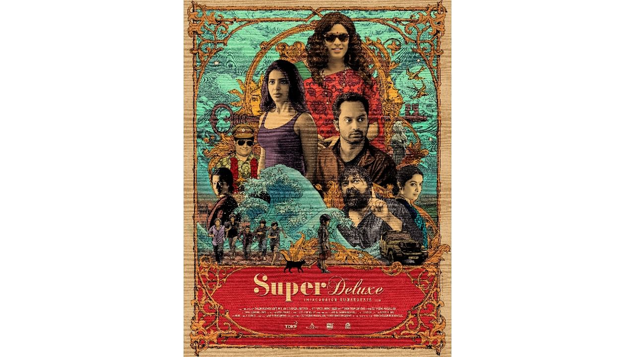
With the poster of the highly-acclaimed film ‘Super Deluxe’ (2019), Gopi proved that hand-drawn posters are just as relevant today. The poster was included in the Oscars library recently.
“The film has many layers. I recreated (the concept) on the poster by hand. When you touch the poster, you can feel the 12 layers of UV printed on it, and every strand of hair. Some elements are glossy gold while some have a matt gold finish,” he says.
Software only as good as an idea
The rapid advancement of technology has pushed the limits of their craft. The tools, colour palettes, and layouts have undergone a massive change, and experiments are happening aplenty.
“Posters of Satyajit Ray films had conceptual art. Today, we have broken new ground in conceptual poster designs with out-of-the-box thinking,” says Jayaram.
Technology is just a tool. How you use it matters, say these designers.
Cover basics
While a designer’s creativity is mostly tied to the film’s concept and the director’s vision, some parameters are critical.
“A rightly chosen colour palette defines the mood of the film. The poster should be conceptualised around the story or the central character. A well-planned photoshoot is important,” says a representative of Kaani Studios in Bengaluru.
The studio’s design aesthetics for posters of pan-India hits like ‘KGF: Chapter 1’, ‘Avanne Srimannarayana’, and ‘Vikrant Rona’ have been appreciated.
Hollywood v/s Indian films
Hollywood movie studios curtail the freedom of designers by asking them to follow specific templates. The Indian film industries offer great room for experiments, these designers say.
Tribute posters
‘Jallikattu’ (2019) was India’s official entry to the Oscars. Within 15 minutes of the release of the film’s trailer, Jayaram made a tribute poster. “The movie had an aerial shot of a crowd running with fire sticks. I took that and juxtaposed it on the image of a bull’s head,” says Jayaram. The poster was a massive hit.
Check out latest DH videos here